
Hello all! It's been quite a while since I've properly blogged. Things have been quite a whirlwind, so the next few blog posts are dedicated on catching up with what's been going on.
One of the biggest events of the past school year took place sometime in April. I've been meaning to post this, but I guess I was just way too focused on getting this entire thing done. I'm sure this is the first time I'm formally speaking about this, but throughout my Senior year of High School I took an Advanced Placement Studio Art Class. Within the year, I am required to create a portfolio with an overall theme to submit to judges in order to receive college credit.
Regarding my theme, I explored the idea of combining traditional media such as painting and drawing, and digital media such as Photoshop to create a series of images heavily inspired by the movement of Art Nouveau and by artists such as Gustav Klimt and Alphonse Mucha.
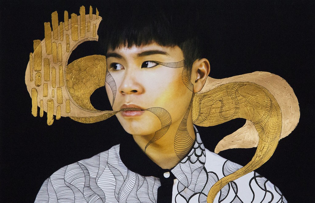
The first three images I created were inspired by Gustav Klimt's works. The heavy golden atmosphere along with various geometric shapes were used to create an ethereal feel with my photos.

As of right now, this one is probably one of my best pieces I have ever made. The photo composition itself was easy, I had Nikki wear a black shirt that I had her lower to expose her shoulders, then adjusted the brightness and contrast so that the paleness of her skin would stand out, and her black shirt would blend in with my black backdrop.
It was printing this photo out and painting on top of it was the challenge! After printing it out, I drew basic patterns as a guideline before painting. Never in my life would I have ever thought of spending 10 dollars on a tube of gold paint. In the end, the final product was completely worth it.
This one was a lot easier compared to the first one. I was more focused on the line work rather than the painting. I find that the combination of both seemed to flow together well.

My last piece in the Gustav Klimt inspired images was a "happy accident". Originally I was in a complete stump over how to finish this. The makeup Sara did on Nikki was amazing and the heavy gold was such a contrast on her very dark lips. I went ahead and drew the patterns in and around the side of her profile, almost detailing out the flow and symmetry of this. I had gold paint on the side of my hand and accidentally rubbed it on where the circles are drawn and it ended up looking really nice! I took a dry brush and went to town on this and somehow, resulted in this.
The next three were inspired by Alphonse Mucha and his whimsical works that are quite often seen in French wine advertisements. The three images I created followed the same process as the first three. I photographed myself, Nikki, and Sara, then edited it to make us look more flat and almost water color like. I printed us out on some sheets of watercolor paper and drew on the rest of the details.
Unlike the first three, I kept a cohesive theme with these ones.
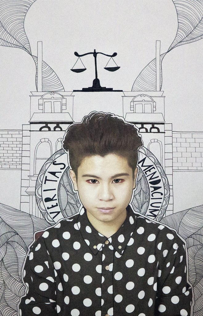
The first one I titled "The Judge". I wrote Veritas and Mendacium, meaning Truth and Lies. The red around my eyes symbolize the idea that justice is blind and swift.
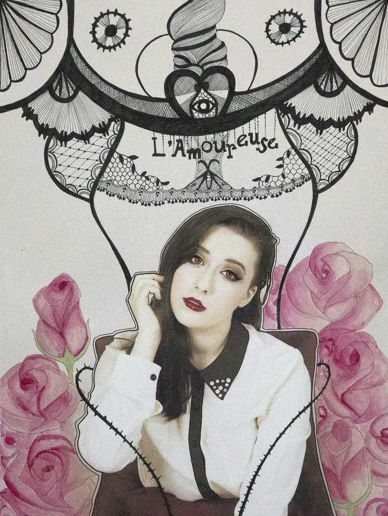
Titled "The Lover", Sara symbolizes the embodiment of the Jury. The ones who weight out the good and the bad and the ones who pass on the final decision.
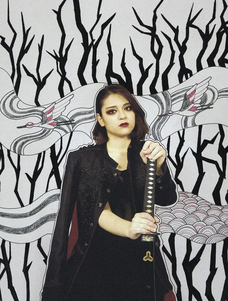
The final piece I titled "Lady Vengeance". I took inspiration from the South Korean movie Sympathy For Lady Vengeance in terms of makeup. The one cohesive trait I added in for all these pieces is the red around their eyes. Lady Vengeance is the "executioner", the Judge examines the innocent and the guilty, the Lover weighs the good from the bad, and the Executioner has the final task.
It was such an experience doing all of this, and quite often I look at these and pat myself on the back for all the had work. What's left now is waiting for the results!
Thanks for reading, and look forward for the next couple blog posts!
No comments:
Post a Comment